
Blog · Image Tutorials · 2026-11-08
← Back to blogText-to-Image vs Image-to-Image: When You Actually Need a Reference Photo
The same prompt, a corgi in a red scarf in the snow, produces completely different results depending on whether you start from words or from a photo. I ran 15 briefs through both routes and four strength settings to draw a clear line for when a reference image is mandatory.
Quick Answer: If Anything Must Stay the Same, Use a Reference Image
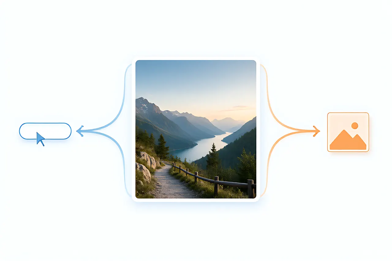
The decision fits in one sentence: if there is any element you cannot allow the model to reinvent — a specific person's face, a product's exact shape, a composition, a palette — use image-to-image. If you have not decided what the picture should look like yet and just want to see what is possible, use text-to-image.
I ran 15 briefs down both routes, then tested strength at 0.2, 0.5 and 0.8 on the image-to-image side. The conclusion is more specific than image-to-image is more controllable: control comes from how much you specify, and strength decides how much the model is still allowed to change.
What We Tested: 15 Briefs, Two Routes, Four Strength Levels
To make the difference visible, each brief used the same prompt text and the only variables were whether a reference image was supplied and how high the strength was. First output only, no rerolls.
- Three kinds of brief: free creation with no reference (5), a specific subject that must be preserved (5), a specific composition or style to reproduce (5)
- Route A pure text-to-image; route B the same prompt plus a reference image at strength 0.2 / 0.5 / 0.8
- Scorecard: subject consistency / composition fidelity / prompt adherence / creative freedom
Text-to-Image: Maximum Freedom, Maximum Drift
Text-to-image has no baggage. Write a corgi in a red knitted scarf sitting in the snow, soft morning light, and the model picks one interpretation from every corgi it has ever seen — often giving you a composition you would not have thought of. It is the fastest route for exploring ideas, finding a style direction, or creating an illustration from nothing.
The price is that it reinvents every detail each time. Run the same prompt five times and the dog's face, the scarf's knit and the angle of the snow all change. To make your first image reliably good, see text to image and prompt structure.
- The good: no reference constraints, maximum freedom over style and composition, ideal for divergence
- The limits: cannot preserve a specified subject, and consistency across multiple images is mostly luck
Image-to-Image: Pin Down What Cannot Change First
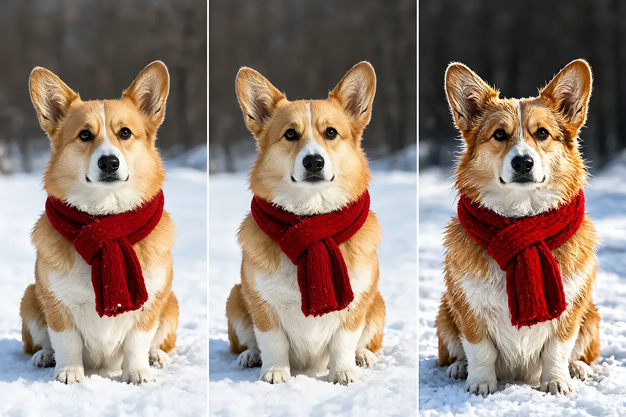
Image-to-image reads your reference first, then rewrites it according to the prompt. Pose, composition and color-block relationships survive while style or local content changes — which is why a reference is mandatory for making a variant, a series, or turning a real photo into an illustration.
In the three-panel comparison, the left panel is the text-to-image baseline. The middle low-strength reference barely moves the pose or scarf position, while the high-strength right panel starts reworking fur and fine detail — push further and it becomes a brand new image. Before uploading a reference, read image-to-image guide for the entry point and parameters.
- The good: subject, composition and palette can be specified, and sets of images stay coherent
- The limits: flaws in the reference are inherited too; less creative freedom than text-to-image
How to Choose Strength: What 0.2, 0.5 and 0.8 Actually Mean
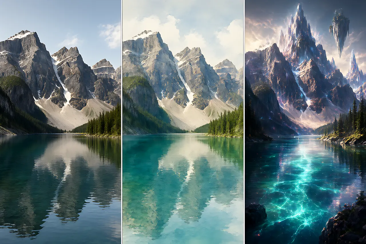
Strength is the only knob here that really matters. My working values: 0.2–0.35 changes texture and detail only (denoising, sharpening, mild stylization); 0.45–0.6 changes style while keeping composition; above 0.7 is basically using the reference as a rough sketch and painting something new.
The three-step ladder on the same mountain lake photo makes it obvious: the low setting barely changes, the middle turns it into watercolor, and the high one is already a different fantasy landscape. Finer step-by-step tests are in image-to-image strength.
- Preserve a person's features or a product's shape → 0.2–0.35, no higher
- Turn a photo into a painting style while keeping the composition → 0.45–0.6
- Only want the reference's mood and rough color blocks → 0.7+, at which point it barely differs from text-to-image
Scenario Decision Table: When a Reference Is Mandatory
The judgment from all 15 briefs, condensed:
- Restyling one selfie into an avatar → reference mandatory, low strength, see image-to-image
- A series of illustrations, a sticker set, or several images in one style → reference mandatory, with fixed strength and prompt
- Changing a product photo's background without changing the product → reference mandatory, low strength plus a mask is safer
- Looking for inspiration, testing styles, generating something entirely new → pure text-to-image, do not hunt for a reference yet
- The reference and prompt contradict each other (daylight photo, night scene prompt) → fix one of them; the model will not reconcile it for you
Three Pitfalls Worth Avoiding
Most failures across the 15 briefs came from the inputs, not the model:
- Pitfall one: a poor reference. A blurry, backlit or tilted image passes all of those flaws faithfully into the output. Start with a clean one.
- Pitfall two: prompt and reference contradicting each other. A daylight photo with neon night scene in the prompt makes the model please both and deliver neither.
- Pitfall three: feeding the previous img2img output back in as the new reference, four or five rounds deep. Detail softens and color drifts each round — go back to the original reference and rerun.
Frequently Asked Questions
Do both routes cost anything? No. Text-to-image and image-to-image here are free, work online, need no sign-up, and download without watermarks.
Is my reference image stored? Images are used only for the current generation; history stays local in your browser and is never archived on a server.
I supplied a reference but it still does not look right? Drop strength below 0.3 first, then check whether the prompt conflicts with the reference. Nine times out of ten it is one of those two.
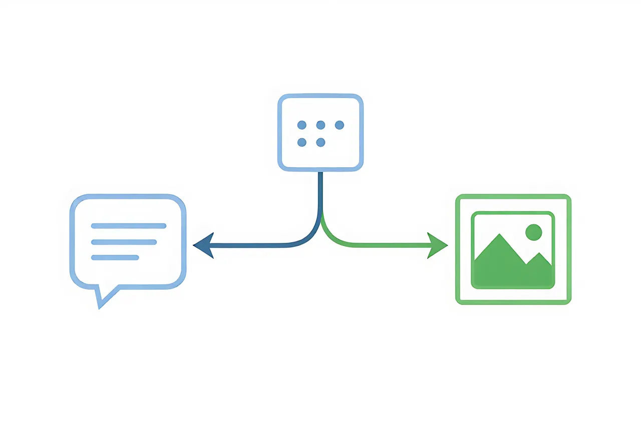
Can I use text and a reference together? Yes — that is exactly image-to-image: the reference defines what to keep, the prompt defines what to change. Do not make them repeat each other.
How do I keep the same person across several images? Fix one reference, one strength and one character description; see character consistency for the full method.
Related tools
Free, no sign-up tools that put the ideas in this article to work.
Related posts
How to Choose Aspect Ratio: A Guide from Social Media to Cinematic Widescreen
Aspect ratio isn't something you figure out after generation and then crop to fit. Different ratios have different composition logic—getting it right upfront saves a ton of regeneration.
Random Seeds and Reproducibility: Why You Can't Recreate Your Image
Made a great image once but can never get it again? Understanding how seeds work will turn your good results from luck into repeatable process.
Old Photo Repair: Should You Restore, Colorize, or Upscale First? A 20-Photo Test
The same damaged old photo can look completely different depending on the order you process it. I ran 20 real family photos through all six possible orders of repair, colorizing and upscaling to find the right workflow, explain why the wrong order amplifies scratches, and compare scanning with phone snapshots.
Product Photos Three Ways: White-Background Cutout vs AI Scene vs Full AI Generation
One ceramic mug, three routes, and only two produced images I would actually list. I ran white-background cutouts, AI scene replacement and fully generated imagery across the same products to compare cost, where the mismatch with the real item creeps in, and why glass and knitwear are trouble.
Turn a Photo Into Art: 3D Cartoon vs Sticker Portrait vs Illustration — Which AI Tool Should You Use?
Same face, three AI tools, three completely different results. A hands-on comparison of 3D cartoon, sticker portrait, and hand-drawn illustration styles: what each is for, which survives shrinking into an avatar, and how to choose without trial and error.
How to Make an AI Avatar: A Hands-On Comparison of 3D Cartoon, Chibi, and Sticker Styles
I ran the same selfie through three tools—3D cartoon, chibi cartoon, and sticker portrait. Similarity, best use cases, and failure modes are all different. Here's how to choose.