
Blog · Tool Guides · 2026-11-08
← Back to blogProduct Photos Three Ways: White-Background Cutout vs AI Scene vs Full AI Generation
One ceramic mug, three routes, and only two produced images I would actually list. I ran white-background cutouts, AI scene replacement and fully generated imagery across the same products to compare cost, where the mismatch with the real item creeps in, and why glass and knitwear are trouble.

Quick Answer: If You Have the Real Product, Do Not Generate From Scratch
Here is the short version. Have the physical item and need a listing image? Cut it out onto white with Background Remover. Want a campaign hero or a lifestyle shot? Use AI Photo Editor to place the real photo in a new scene. Only use text-to-image when nothing has been produced yet, or when you need a pure concept image.
I ran 9 products — a ceramic mug, a glass, a knit sweater, earbuds, a skincare bottle and more — through all three routes. The finding is blunt: the first two stay faithful to the product, the third looks great but is unreliable, because the item it draws is rarely the one on your shelf.
What We Tested: 9 Products, Three Routes, Judged by Listing Standards
I deliberately picked products with very different cutout difficulty so the boundaries of each route would show, rather than choosing the most flattering example.
- Products: ceramic mug, glass cup, knit sweater, black earbuds, glossy skincare bottle, leather wallet and 3 others, covering transparency, fuzzy edges, dark tones and reflections
- Three routes: white-background cutout / real photo in a new scene / fully generated from text, one run each with no compositing
- Scorecard: fidelity to the real item / clean edges / believable shadow / time per image / whether it can go straight into a listing
Route One: White-Background Cutout, the Listing Standard
Swapping a cluttered desk for clean white is the fastest and most faithful of the three. The product itself is untouched — its color, shape and small imperfections all stay real — and marketplace main-image rules favor exactly this look.
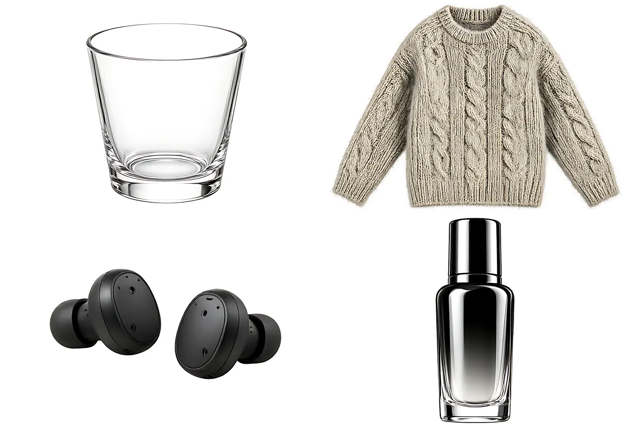
The difficulty is entirely in the edges: a transparent glass carries the background through it, knit fibers get shaved flat, and dark earbuds merge into dark shadows. Zoom in on those three cases, and if needed repair just the edge with inpainting instead of redoing the whole image.
- The good: fast, faithful, best marketplace compatibility, ideal for large SKU counts
- The limits: clean but without atmosphere; transparent and fuzzy materials need an extra check
Route Two: AI Scene Replacement, Best Value for a Real Photo
Put the cut-out product on a marble counter, a wooden breakfast table or in soft window light, and the image shifts from catalog shot to lifestyle shot — while the product is still the one you actually photographed. One sentence describing the scene is enough.
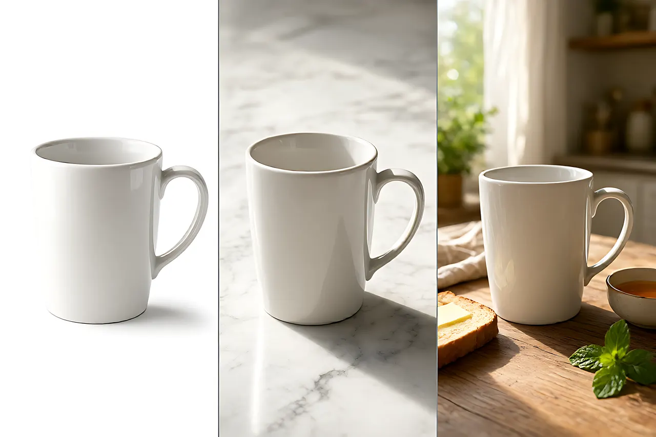
The middle panel in the three-way comparison is this route: the glaze reflection and handle curve match the original exactly, only the table and light changed. For a full treatment of white, gradient and scene backgrounds, see product image backgrounds.
- The good: faithful and atmospheric in one image — detail pages, campaign banners and social posts covered
- The limits: the shadow direction has to match the scene light or the product looks like it is floating; keep the scene from upstaging the product
Route Three: Full Generation, Only When There Is No Physical Product
Pure generation has the highest ceiling: any scene, any light, any prop you can describe. But it draws a mug that fits the description, not the mug in your warehouse. Of my 9 products, only 2 came out close enough to the real item to be recognizable.
That makes it right for concept images during product selection, atmospheric detail-page illustrations, and packaging previews before sampling — not for a main listing image. If you use it, build a solid prompt first with the text to image guide, and label it clearly as an illustration.
- The good: no dependence on a physical sample or a location, fast and stylistically free
- The limits: mismatch with the real item is structural — color, logo and handle position can all differ. Never use it as the listing image
Four Product Types, Four Difficulty Levels
Cut out to white sounds like one task, but the difficulty varies. Check which type you have before you start:
- Matte ceramic and metal: easiest, crisp edges, one pass
- Pure white or pale products on white: they blend together; cut out against light gray instead
- Knitwear, plush and flyaway fibers: the edge is a gradient, so zoom in and do not shave the fuzz flat
- Transparent glass, glossy bottles and mirrored reflections: hardest — the background shows through and reflections get treated as the subject. Often better to keep the original scene and just clean it up
Scenario Decision Table: Choose by Where the Image Will Appear
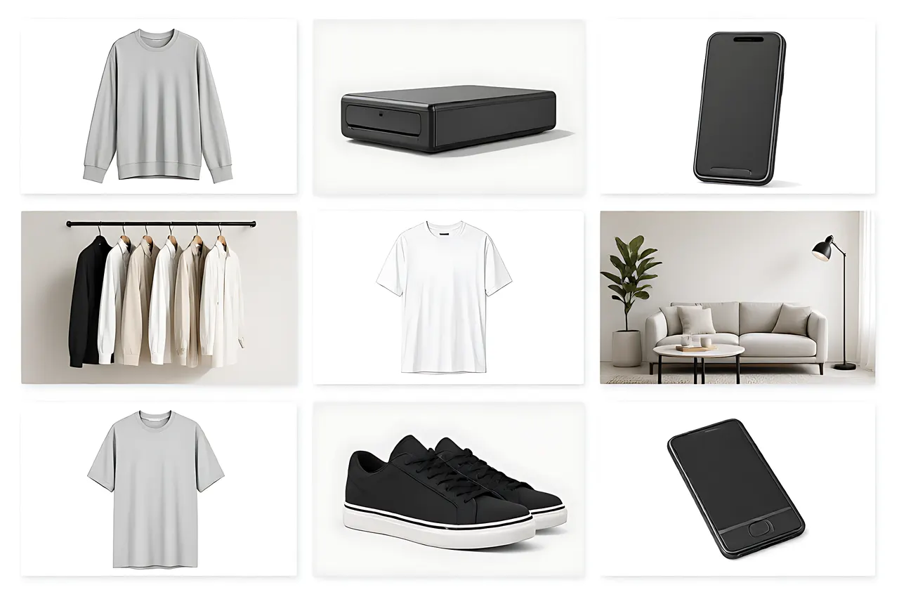
Here are the common requests mapped to a route, so you do not have to try all three:
- Marketplace main image, SKU grid, white-background requirement → Background Remover, route one
- Detail-page atmosphere, campaign banner, social post → cut out first, then AI Photo Editor for the scene, route two
- No sample yet, product selection or a concept pitch → text-to-image, route three, labeled as an illustration
- Cluttered background but the product must not change → follow the edge guidance in cutout & background replacement first
- A consistent set of SKUs → fix one backdrop color and one light direction, then follow batch-generating images
Three Pitfalls Worth Avoiding
The failures across these 9 products were almost all preventable:
- Pitfall one: using a fully generated image as the main listing photo. The buyer receives something different from the picture, and returns and bad reviews start there.
- Pitfall two: ignoring light direction when swapping scenes. A product with a top-left shadow on a scene lit from the top right looks fake instantly. Have the shadow redrawn, or use soft overhead light.
- Pitfall three: forcing transparent or white products onto a white background. Edges either disappear or keep a gray halo — a light gray backdrop or the original scene is easier.
Frequently Asked Questions
Are the tools for all three routes free? Yes. All work online, need no sign-up, and download without watermarks.
Are my product images stored? Images are used only for the current generation; history stays local in your browser and is never archived on a server.
Can generated scene images be used commercially? Output is watermark-free and fine for product pages, but do not generate other people's brands, logos or copyrighted elements.
Can I process dozens of SKUs at once? Yes — test one item to lock the backdrop color and light, then batch the rest with the same settings so the set stays consistent.
Is a phone photo good enough? Yes. Shoot in indirect window light, avoid cluttered backgrounds and harsh reflections; that helps far more than repeated retouching.
Related tools
Free, no sign-up tools that put the ideas in this article to work.
Related posts
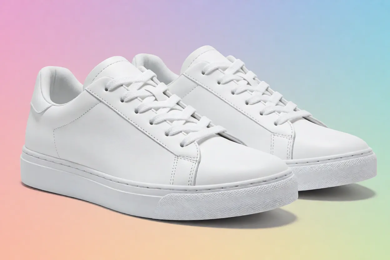
Cutout & Background Replacement: Complete Tutorial for Clean Edges and Matching Lighting
The biggest worries when replacing backgrounds are rough edges and mismatched lighting. I break background replacement into three steps, each with specific checkpoints.
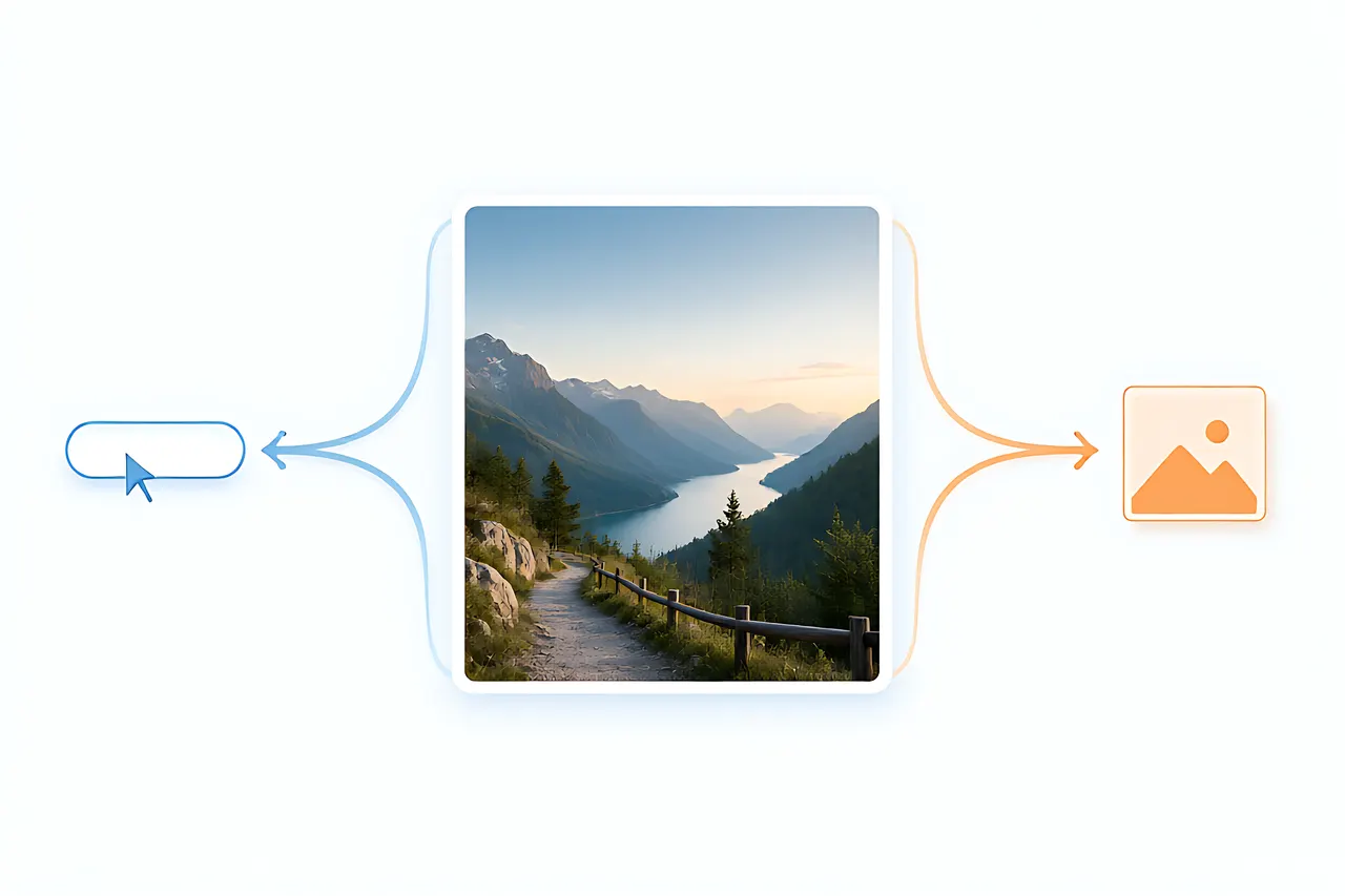
Text-to-Image vs Image-to-Image: When You Actually Need a Reference Photo
The same prompt, a corgi in a red scarf in the snow, produces completely different results depending on whether you start from words or from a photo. I ran 15 briefs through both routes and four strength settings to draw a clear line for when a reference image is mandatory.
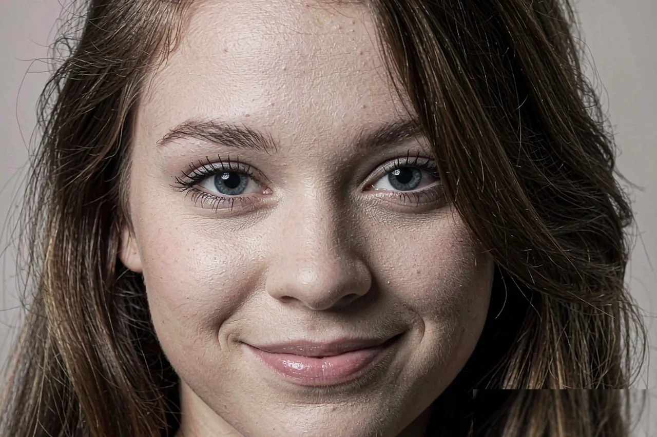
Turn a Photo Into Art: 3D Cartoon vs Sticker Portrait vs Illustration — Which AI Tool Should You Use?
Same face, three AI tools, three completely different results. A hands-on comparison of 3D cartoon, sticker portrait, and hand-drawn illustration styles: what each is for, which survives shrinking into an avatar, and how to choose without trial and error.
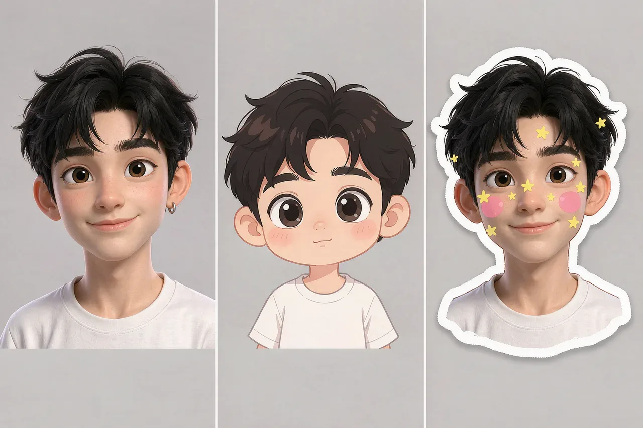
How to Make an AI Avatar: A Hands-On Comparison of 3D Cartoon, Chibi, and Sticker Styles
I ran the same selfie through three tools—3D cartoon, chibi cartoon, and sticker portrait. Similarity, best use cases, and failure modes are all different. Here's how to choose.
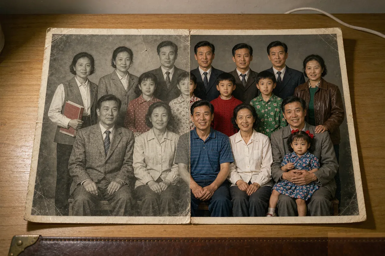
How to Colorize Black & White Old Photos with AI: A Real-World Test of 3 Color Styles
With one 1979 black-and-white family photo, I tested three colorization approaches—natural restoration, vivid cinematic, and seasonal mood. Skin tone differs the most; clothing color fails the most. Includes prompt patterns and the right order of operations.

How to Handle Portrait Backgrounds: A Tutorial from Cluttered to Clean
Background isn't the supporting actor—it determines how professional your portrait looks. I used the same face with five different backgrounds, and the difference was greater than switching styles.